University, Vienna, Austria
The university building in Vienna’s Währinger Straße does more than fill a hole between buildings; it combines several faculties and provides a place to learn and teach. A coherent concept ensures architectural harmony.
For the architects at the Viennese NMPB office, planning the university building in Vienna’s Währinger Straße brought with it many challenges: as well as fill a gap that had existed since the Second World War, the building also had to optically fit in with the surrounding historic buildings. In order to connect the differently aligned neighboring buildings with the new construction, the architects planned an alcove and pondered the building’s exterior shell for months.
The new building combines the faculties for communication sciences and IT, which were previously housed separately. This merger required very efficient and rational spatial planning: the amount of space required was considerably greater than the area of the plot. Therefore, the architects decided not only to build up, but also down. The finished building offers space for 1,100 student workplaces and 225 office workplaces. The ‘L’ shape of the building allows the faculty library, lecture halls and seminar rooms to all share the building on Währinger Straße.

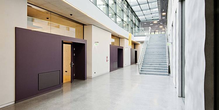
The selection of colors - where the architects were given free hand - combines the different interior areas harmoniously. Designed to save space, the compact foyer offers views from and to the courtyard, and the library boasts a transparent, generous atmosphere. The lecture halls were designed with golden anodized aluminum panels to optically highlight their status. The seminar rooms are dominated by visible concrete panels with different levels of gray, complemented by well-calculated color accents in bright red and mustard floors. The red surfaces are more than just color accents: they are textile acoustic panels that help to reduce noise levels in the building. Red and yellow accents are also found in working areas for students. Black door frames, table legs and feet complete the interior color profile.
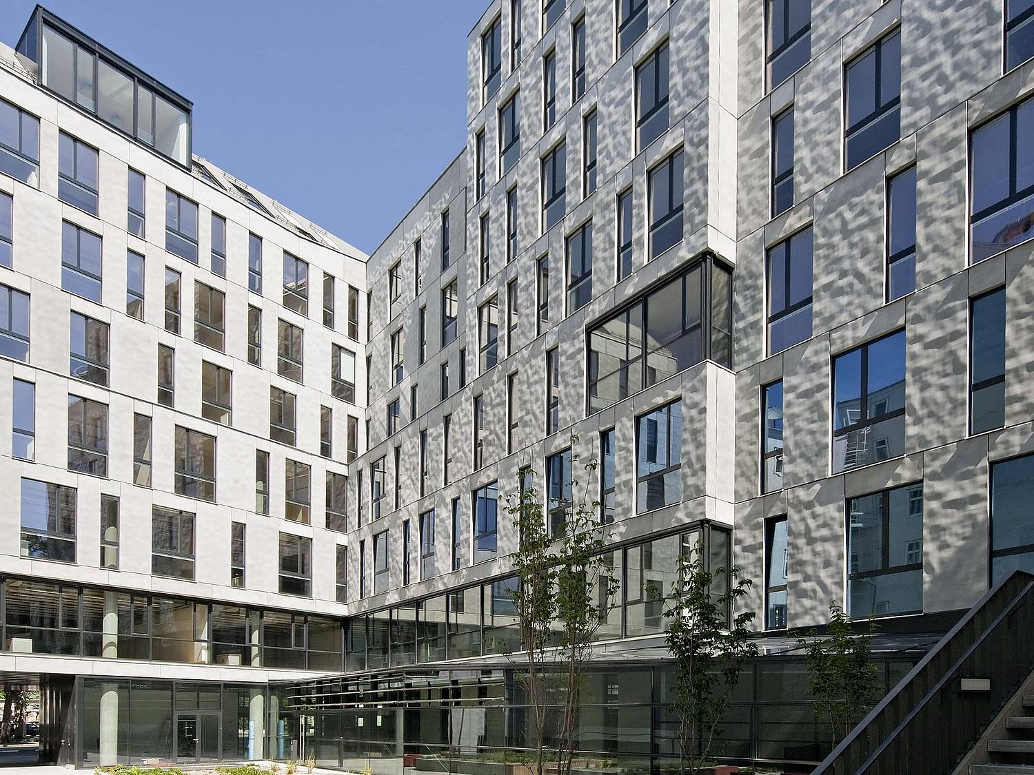
For the exterior of the university building, the architects opted for the use of prefabricated elements. 900 pieces were required. They were designed with the help of a custom formliner from RECKLI, which gave the façade a waved relief. The play of light and shadow brings out the best in this three-dimensional surface: when lit from the side, the elevations and indentations appear especially prominent - an effect that invites you to stay and gaze.
During which you can position yourself on one of the benches in the building’s interior courtyard. The interior courtyard is also open to the general public: a passage directly next to the entrance will take you through the courtyard to the neighboring buildings. From one of the many seating options, you can let the view of the building’s interior wash over you as you remember your own time at college.
