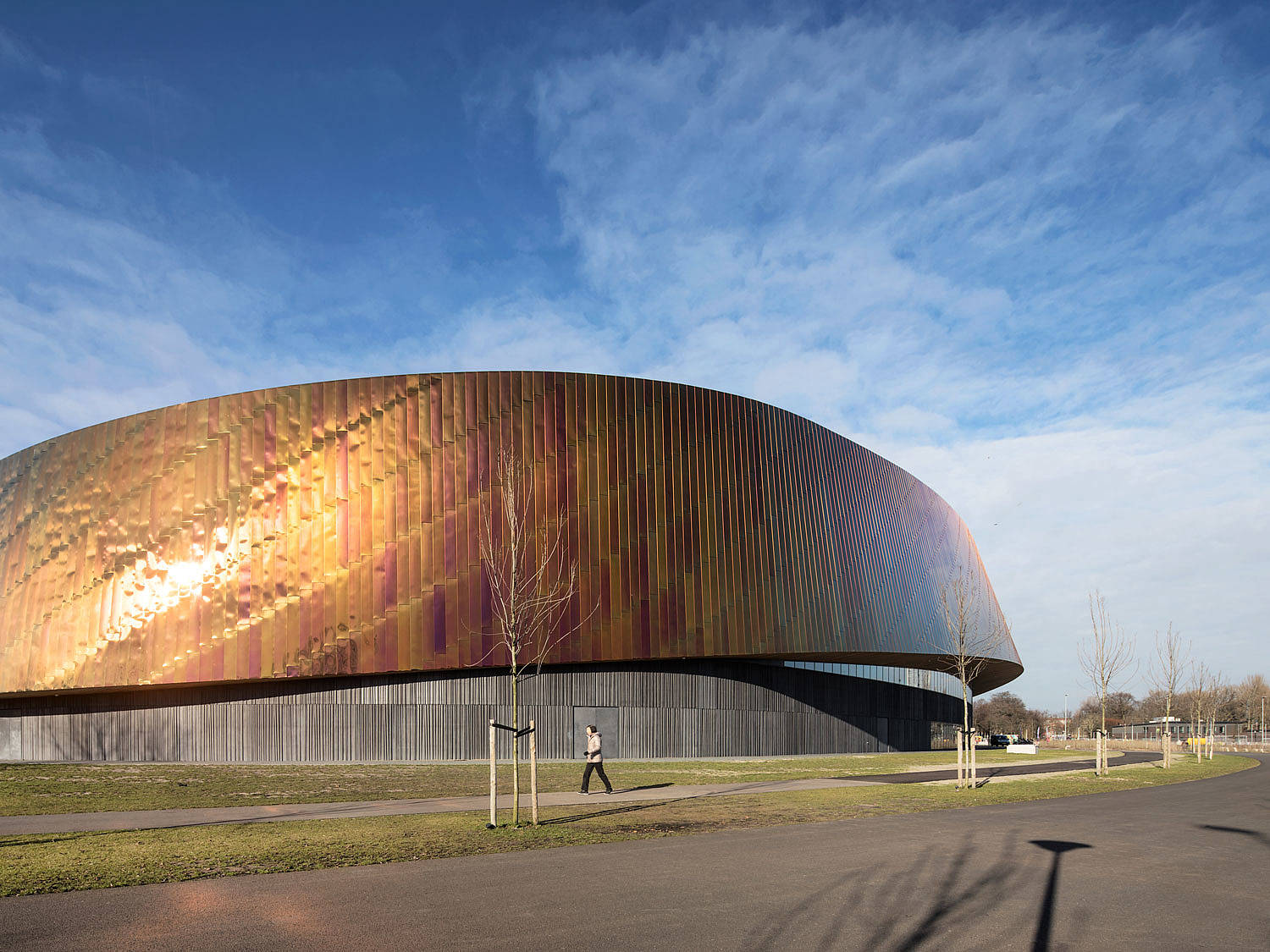
Sportcampus Zuiderpark, Den Haag, Netherlands
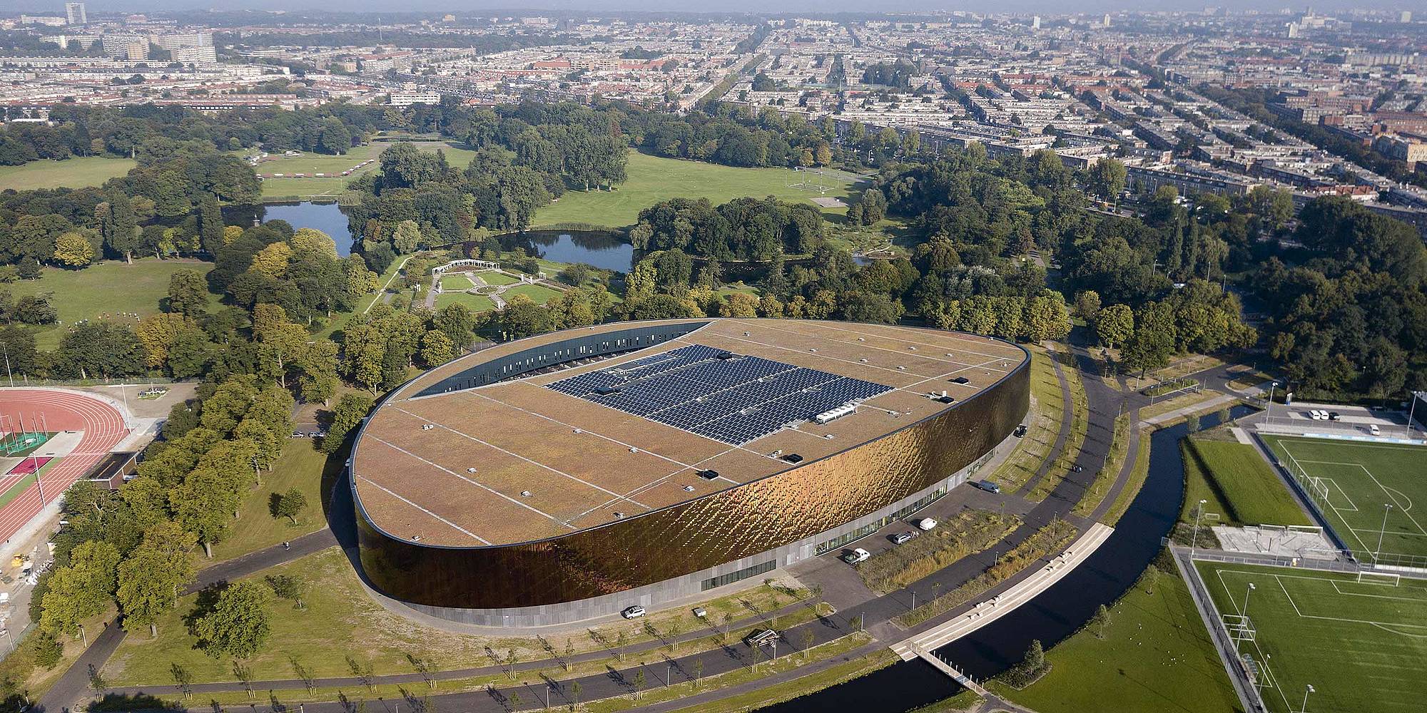
Colors and materials give the Sportcampus Zuiderpark an iconic look. The flowing design effortlessly finds its place in the surroundings and is just as in motion as the people who play sports here.
The building rises gently from the landscape. A delicate, warm shimmer swells to a fiery red and captivates the eye. The Sportcampus Zuiderpark nestles amidst the surrounding landscape and makes a visual statement with its interplay of steel and concrete.
The campus in The Hague, completed in June 2017, is a cooperation between the city of The Hague and two private partners. With the help of entertainment and education, the sponsors want to promote the importance of sports and exercise for a healthy society. Inside, sporting competitions from soccer to judo are held, and the building also has classrooms. The construction of the building took slightly more than two years and cost 45 million British pounds. British architects FaulknerBrowns won the tender.
The architects responded to the brief that the building should reflect the principles of movement and activity with an oval design that smoothly overcomes height differences. " At ground level, the curved form of the plan is expressed by a simple plinth constructed from textured precast concrete panels. The upper part of the elevation is expressed as a metallic ‘ribbon’ that narrows and twists to reveal glazing on the elevation," says Edward Shanks, Marketing Director at FaulknerBrowns.
The "ribbon" that the architects have wrapped around their design is elegant and colorful: Made of polished stainless steel, the metal strip takes on different colors depending on the incidence of light, ranging from a warm yellow to flaming red and a delicate pink.
Embedded in the surrounding greenery, the curved shape of the building creates the impression that its sides slowly merge with the landscape. The Sportcampus Zuiderpark only reveals its size of 33,000 square meters on closer inspection: The actual sports areas - an arena with viewer stands, a multifunctional hall, a beach sports hall and a gymnastics hall - are located at the rear of the building, which opens onto the city’s side. The classrooms are located at the front end as they do not require a high ceiling. This layout allows for a flat front of the building that blends into the surrounding nature.
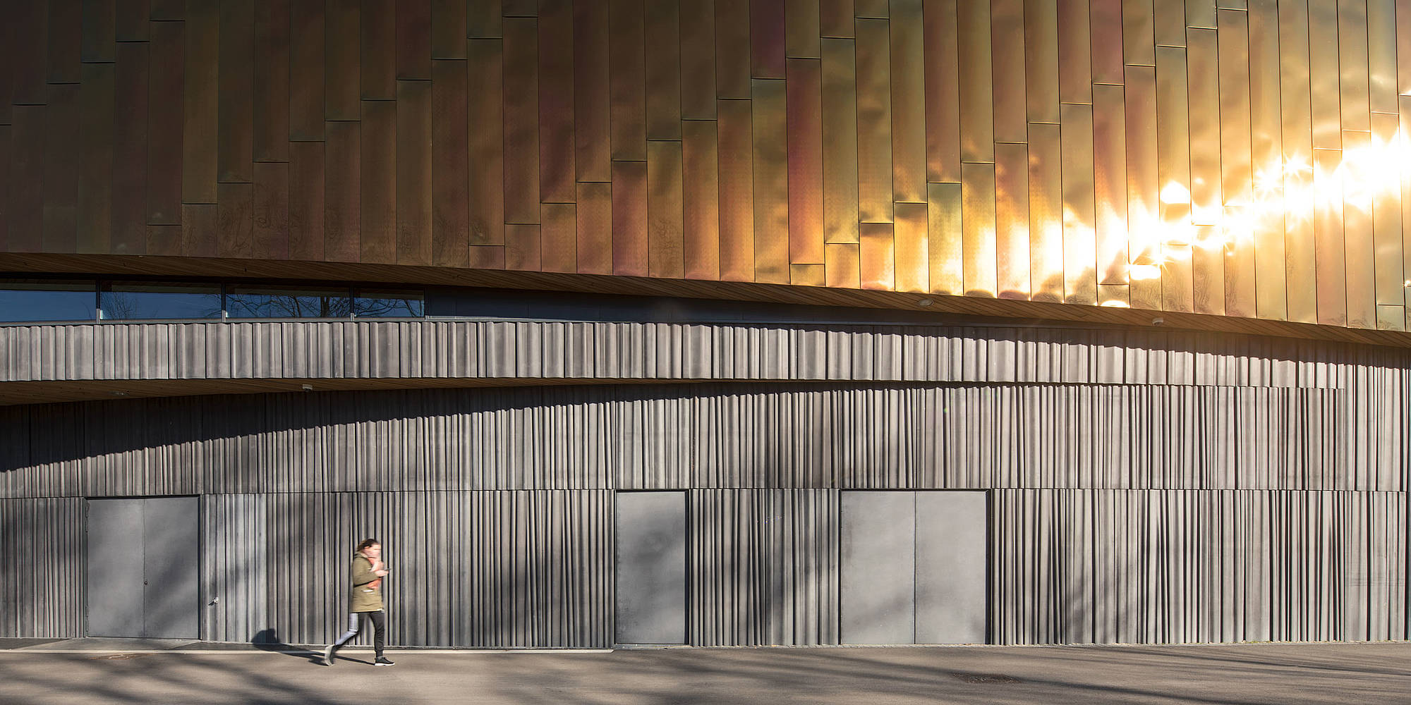
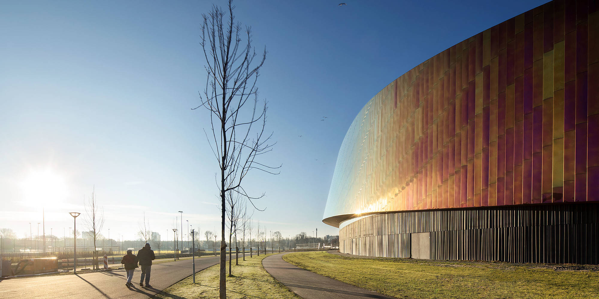
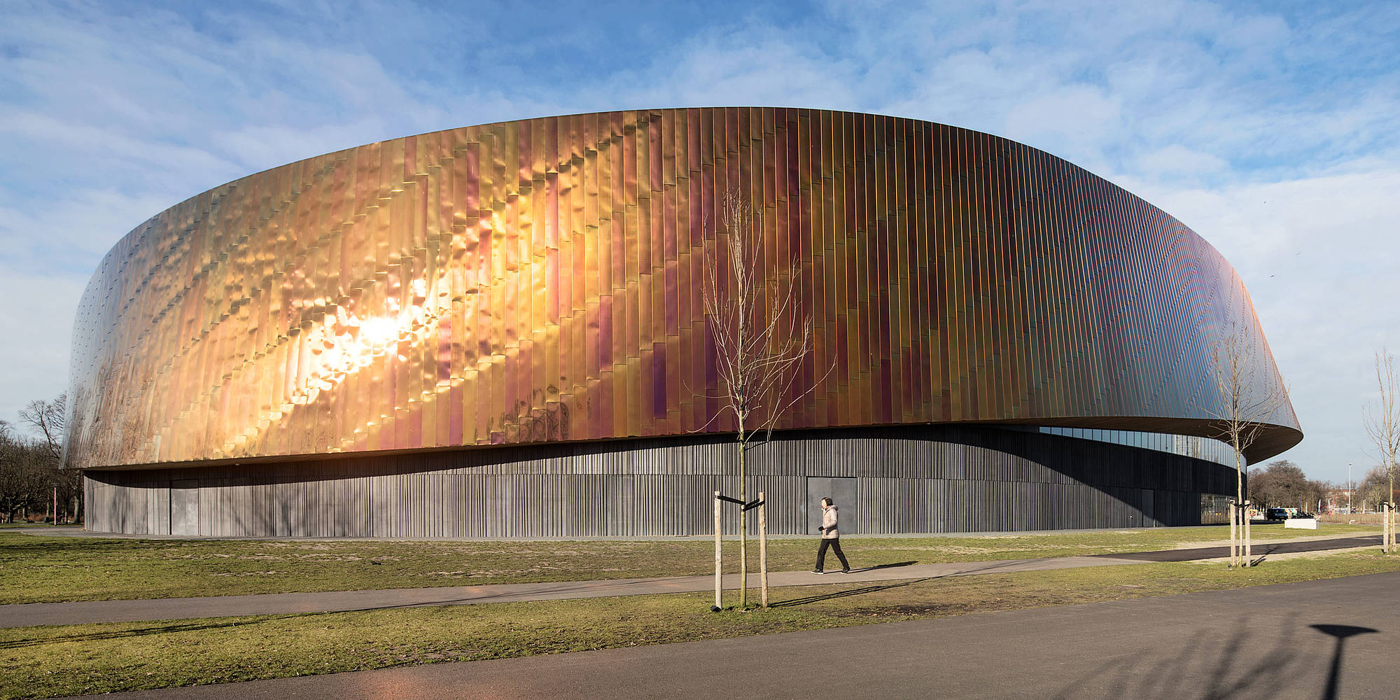
In order to represent the smooth and flowing height differences of the building, the architects needed malleable materials. They opted for steel panels that were flexible enough to be used on the façade. The steel is 0.8 millimeters thick and was polished with a special finish that creates a reflective effect. Light is reflected at different wavelengths and creates a rich play of colors on the panels.
Although they are mounted individually, the steel panels lend a homogeneous appearance to the building’s metal strip. The slightly offset height of their lugs contributes to the building’s flowing character. " With such a dramatic overhead form we considered it necessary for the plinth to be visually subservient, especially when viewed from a distance", says Shanks. With the use of precast concrete elements, the curved shape of the building could be perfectly reproduced. The precast concrete elements were cast with glass fiber reinforced concrete by specialist Polycon. FaulknerBrowns wanted a strong vertical structure for the concrete surfaces to mask the flowing difference in height, especially in the narrow side areas of the building, and to create the impression of a cohesive plinth. They opted for the elastic formliner "Liberty", a fantasy pattern with a wave design that visually stretches the plinth. The pattern gives the concrete surface the appearance of a curtain with wide, flat throws. The use of the mold lends the exposed concrete a lively, light character while the structure's profile depth allows subtle shadows that gives some depth to the façade. A further benefit: It hampers graffiti from damaging the façade.
FaulknerBrowns already worked with elastic molds in another project: The architects also used the "Liberty" pattern to create a special effect on the façade of the "The Word" library in South Shields, which they designed. Their design won the 2017 RIBA National Award as one of the best new buildings in the UK.
For the Sportcampus Zuiderpark, the planners decided to cut four panels each with different profiles from the molds. By inverting the panels, they were able to cast eight finished parts, each with different profiles, from a mold. "A deliberate choice was to randomize these so that there was no need to align patterns at the edge of each panel", says Shanks. This decision not only spared them the precise alignment to ensure the pattern’s exact connections. "In addition; whilst the vertical patterning was important we believed that the irregular and natural feel of the ‘folds’ would further add to the interest at close proximity." The world of architecture agrees: FaulknerBrowns’ design was distinguished at the World Architecture Festival 2018 and received a German Design Award for Excellent Communications Design in the Architecture category.
