Ibis Styles Airport Hotel, Budapest, Hungary
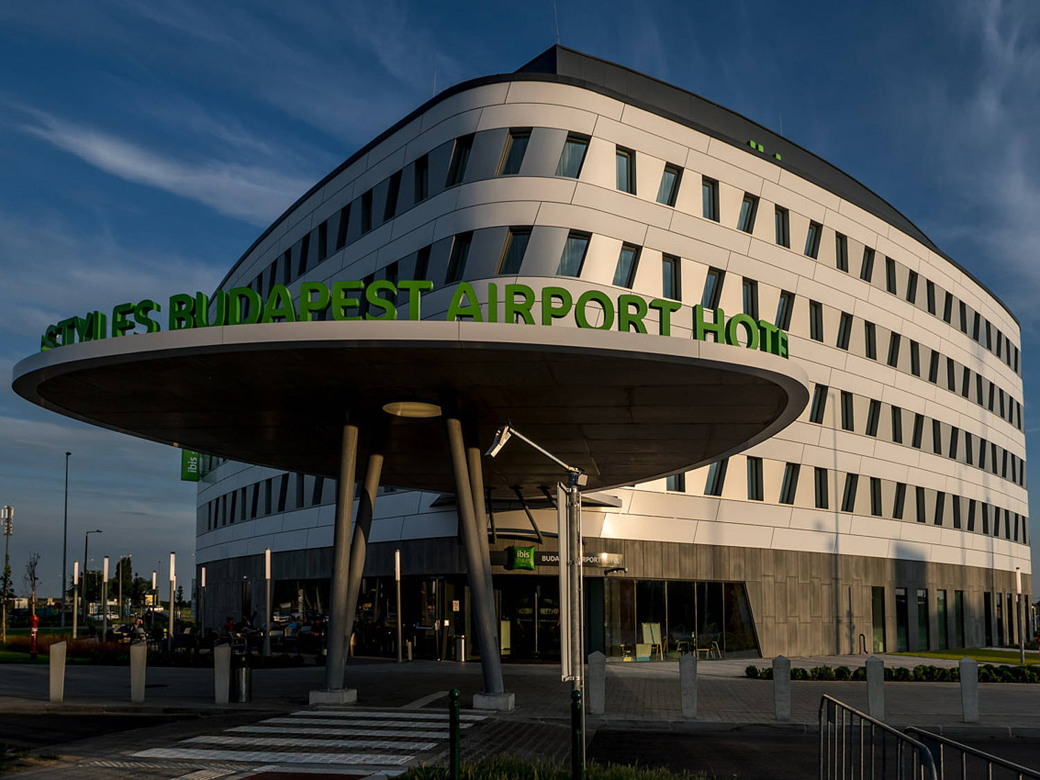
At the Ibis Styles Hotel at Budapest Airport, the clue is in the name: the architects designed an inviting hotel with a direct connection to the terminal.
Airport hotels are no longer gray and depressing. Gone is the time of plane traffic making the windows rattle, a room every bit as gray as the hotels’ surroundings and food choices limited to cookies or chips from a vending machine.
In Budapest, the Ibis Styles Airport Hotel just goes to show how refreshing an airport hotel can be nowadays. The hotel has been welcoming guests at Liszt Ferenc International Airport since January 2018. That same year, it was crowned Hungary’s most promising new hotel and secured itself a place among the country’s six best hotels.
“The building is mostly designed for travelers and passers-through,” say the architects from Hungarian firm Aspectus. They came up with their design for project developers WING and Budapest Airport. It’s the country’s first hotel to have a direct connection to a terminal.


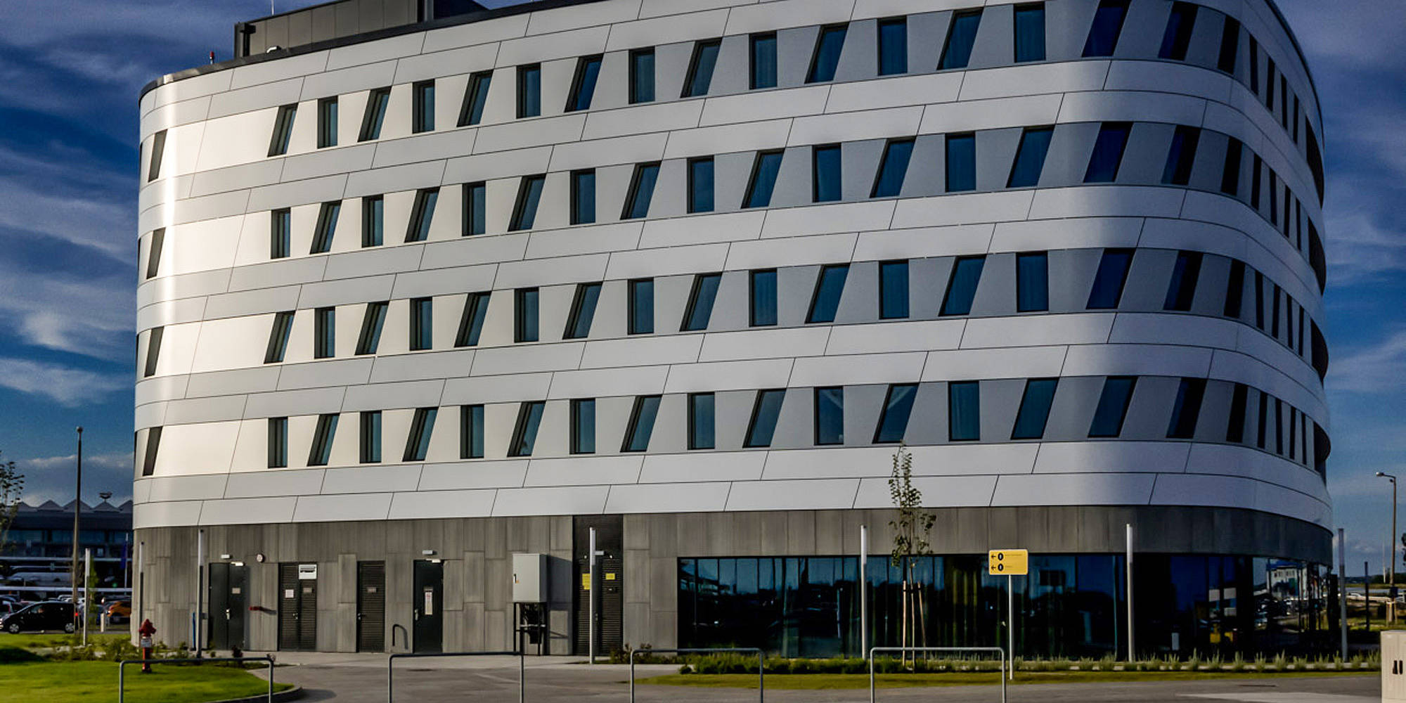
The Ibis Style was erected on the former site of a parking lot outside Terminal 2. Aspectus designed a five-story building with 5,200 square meters of usable space and 145 rooms. From the terminal, a walkway leads to the hotel’s protruding canopy. Designed as a cube, Aspectus rounded the corners of the building and rotated it. The canopy and entrance are positioned at one of the building’s softly rounded corners, making the building seem narrower. Windows that alternate between straight and slanted add a dynamic look to the exterior.
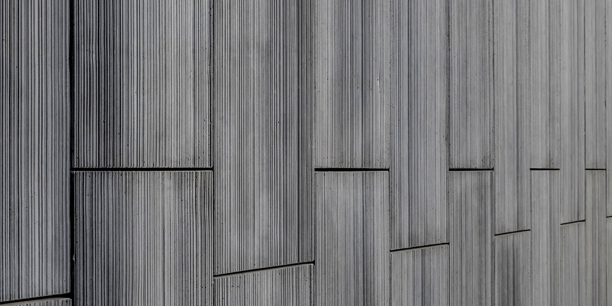
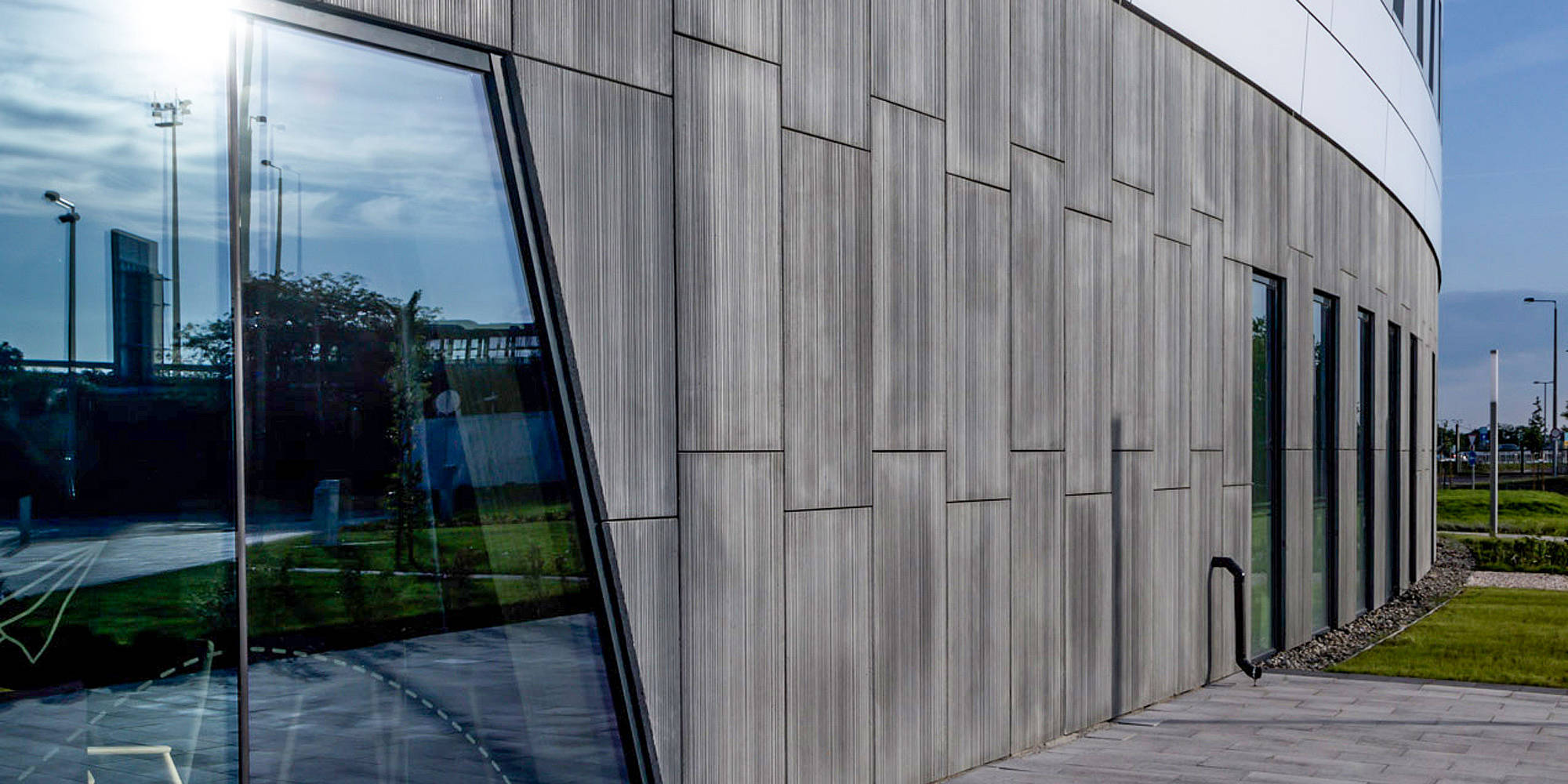
For the façade, the architects chose a dark gray band of prefabricated concrete elements on the ground floor to stand out from the white façade above. The prefabricated elements were designed with the help of RECKLI SELECT formliners. Moldau 2/98 is an abstract texture with lines and parallel channels of varying widths and depths. The surface finish is smooth and fine.
As the Ibis Styles chain uses a unique design motif for each of its hotels, this hotel was also given its own identity. Aspectus and the IDM Group interior architects threaded a travel and globetrotter theme through the whole design. In the lobby, visitors are greeted by an image of a city map behind the reception desk, while the room walls are decorated with instructions for a paper airplane. The project team understood that the travel experience is impacted by pre-flight or post-flight accommodation and created a soothing atmosphere for globetrotters.
